Case Study: Spotify Queue Interface
Changing the way that users interact within the queue. In this design, my emphasis was to find a way to minimize user-error in Spotify's queue interface and have a smoother experience when navigating the interface.
It all started with an idea
The idea materialized during my Psychology of Human-Computer Interaction course, where I experienced the design process of transforming a product.
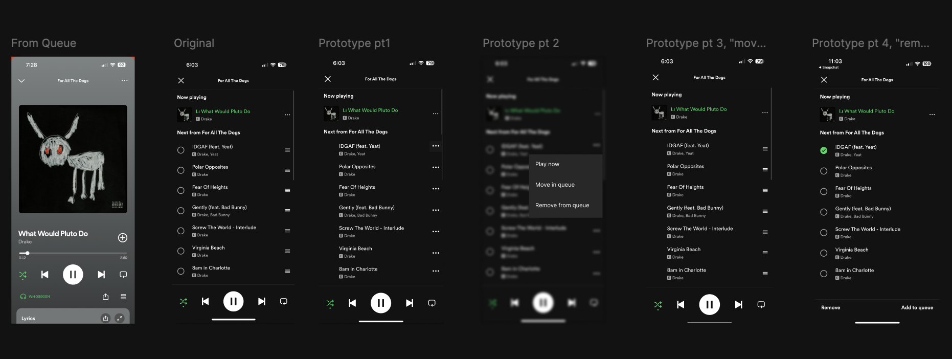
In revising the queue interface design, my aim was to enhance user experience by minimizing errors and ensuring seamless interactions. While the current interface functions adequately, it is prone to user mistakes. The new design incorporates key concepts from the existing version, making it more accessible and offering distinct functionality for all users.
The wireframes evolved with vibrant colors and fonts, transforming sketches into a dynamic showcase. Each version improved functionality and design, enhancing user experience. I tested and adapted based on feedback for quick updates while preserving innovative edge. The result was a user-friendly interface. By adding interactive features, I fostered a seamless connection between user needs and actions, showcasing commitment to innovation.
Overview of each stage, beginning with the 'Original' version and detailing the steps in the prototype.
Instruction Manual for new design
Figma Interactive
Interact with my design and navigate the Interface.
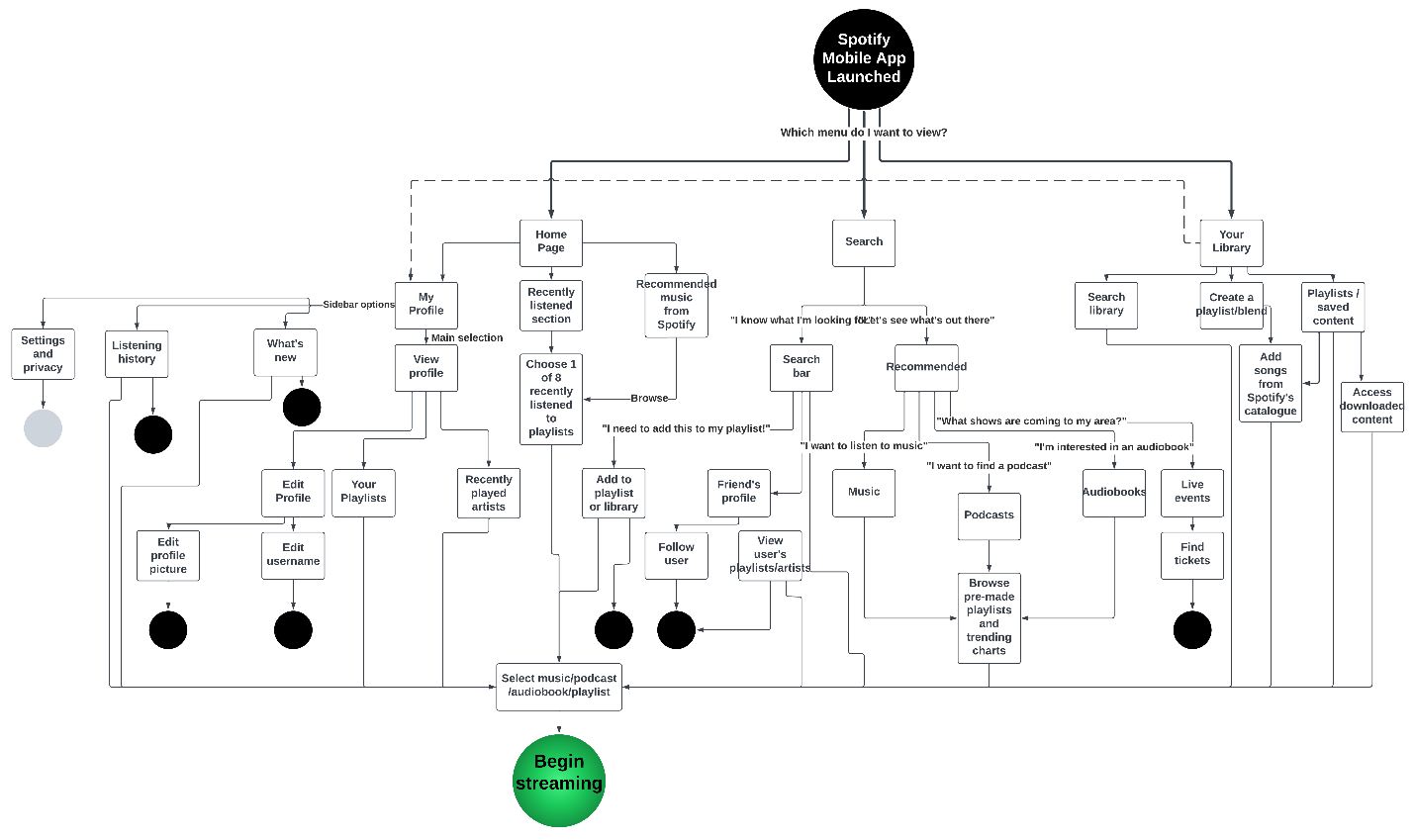
Activity Chart
The project focused on enhancing the Spotify queue interface for an improved user experience. I employed various testing methods to understand user interactions and collect feedback. Usability tests, both in-house and external, were essential. A/B testing compared user metrics pre-and post-update, while error analysis helped identify issues based on logs and reports. Initial tests with a select group revealed real-world insights, while user surveys captured satisfaction and preferences. This organized strategy validated the update's success, leading to increased user satisfaction, higher task completion rates, and an overall better experience with the Spotify queue.
Before Interface Update:
Task Completion Rate: 70%
User Satisfaction (NPS): 25
Average Time Spent in Queue: 3 minutes
Frequency of Queue Interactions: 5 times per session
Error Rate in Queue Interactions: 15%
User Retention Rate: 60%
Adoption Rate: 40%
Number of Queued Songs: 8
Conversion from Queue to Playlist: 10%
After Interface Update:
Task Completion Rate: 80%
User Satisfaction (NPS): 30
Average Time Spent in Queue: 2.5 minutes
Frequency of Queue Interactions: 6 times per session
Error Rate in Queue Interactions: 10%
User Retention Rate: 65%
Adoption Rate: 45%
Number of Queued Songs: 9
Conversion from Queue to Playlist: 12%
After the updates to the queue page, users found it easier to interact with their music. Concerns about mistakes faded as the new model prioritized user-friendly navigation. This change led to exciting results: task completion rose by 10%, user satisfaction improved by 5 points, and average time in the queue dropped by half a minute.
Users explored the queue more often, with a 1-time increase per session, while the error rate in interactions fell by 5%, creating a smoother experience. Both user retention and adoption rates climbed by 5%. Additionally, more songs were queued, and the transition from queue to playlist became more seamless, reflecting higher user engagement. Overall, the interface update significantly enhanced the user experience with Spotify's queue feature.
This data shows the positive changes in how the new interface was used. My main goal was to reduce error rate and ensure that any user was able to use it, regardless of their needs. While there was an improvement, if I continued with this project I would conduct more research throughout the entirety of the design process, especially near the end.
After this project, Spotify released an update in which they had a very similar design to mine, which I enjoyed and thought was very cool to see that my design was on the right track. The new interface design had the sliders and buttons in the queue page, which allowed users to have more control while in the queue.
Full Circle
Reflecting on the prototype designs, my journey to enhance the Spotify user experience has been fulfilling. My aim was to craft a user-friendly and engaging interface that resonates with users, setting Spotify apart.
This success came from transforming my ideas into a compelling experience. It required substantial dedication to ongoing redesigns and alignment with Spotify’s evolving vision. I faced challenges in refining intricate details, making them functional and intuitive, but persistent iterations revealed what truly enhances user experience.
Achieving my goals involved continuous redesign and introducing features that change how users engage with music. This journey not only advanced the user interface but also solidified Spotify’s leadership in the music platform space—showcasing my commitment to innovation.
Now, I will focus on thorough testing to gather feedback and understand real-world user interactions, preferences, and challenges. The insights gained will guide the product’s evolution, ensuring my design aligns with user expectations as I refine new features through an iterative process.
I will keep a dynamic document to capture our design journey, reflecting on how our ideas evolve. This living document highlights our teamwork and the reasons behind our design choices.
A strategic changelog benefits the product by keeping current users informed and enticing new ones. It demonstrates the app's growth and dedication to improvement, encouraging user feedback. I aim to refine features through testing, maintain our documentation, and leverage the changelog to enhance engagement and grow our user base. This data-driven strategy ensures the product remains user-focused and adaptable to evolving preferences and technologies.
Skills Used in this Experimental Design
Figma
User Stories
Activity Chart
UX Testing & Research
Heuristic Analysis
Prototyping
Wireframing
Adobe Photoshop


